| |
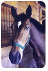 |
Kirralee said:
https://i.postimg.cc/g2nPms7G/EE58-E956-68-DD-47-AA-AA64-CFF27-AD7071-C.png
The hair ends on the forlock are rather bluunt,try use a brush <1 px If you use ibis paint the is a button (next to the ruler one if you press it you may find something called 'force fade' make sure it is on and continue ^-^ hope this helps |
|
|
| |

|
Kirralee said:
https://i.postimg.cc/g2nPms7G/EE58-E956-68-DD-47-AA-AA64-CFF27-AD7071-C.png
Overall I really like the composition of this image Kirra. It's dramatic and the pose of the horse stands out with the hills in the background framing it. Composition of the horse can make or break an image I find and you have really played it to your advantage here! Great job! Nit picking I'd say make the horse slightly larger to fill the canvas more. I try to make my horse fill as much of the image as possible.
I love using Ben from BlueBird_Stock so you have done a pretty smooth job colour changing him to white from black. He's quite a dramatic moody pony isn't he? I'd try to make the variation between coats slightly more jagged and not as soft. You have lost the shadows a bit in the right front leg. I'd redraw them in black on a new layer set to softlight and as clipping layer on the horse. Then smudge that layer so it becomes smooth. I do this over the entire horse in black and white for highlights. This will help intensify any shadows or highlights lost in the recolouring process. I'd also do a new layer clipping mask outlining the body to create a rim light effect. You could also at the end flatten the image and add a sunflare render where the neck and butt meet to make it uber dramatic lighting. (this is a personal artistic choice as I love love love dramatic lighting in pieces). I'd also do this for the mane and create a halo like glow around the tail and forelock. Light passes through less denser strands of hair easier than thicker parts. This helps tie into the overall image of the piece. Also perhaps maybe vary the overall length of the forelock it seems very military cut all on the length and angle.
Overall I really like this piece and you can really feel the air and mood of this artwork. :) |
|
|
| |

|
Thank you :D
He was a little smaller as I was originally going to have him holding a rose but change my mind |
|
|
| |
|
Raven Hollow Elite said:
This is very nice of you trillium!https://i.postimg.cc/k59dn6tW/Untitled159-3.jpg Any way I can make this better?it's for a high stakes contest
This is a really nice subtle background and foreground blur to highlight the horse Raven. It's done really nicely and really focuses the view on the horse.
The overall lighting of the piece ties in nicely while being dramatic but not to harsh to the eye, a good subtle balance. Since you're using ElaineSelene as a stock provider I'm guessing the horse was bay originally and Nate? If so that is an epic colour change girl! Great effort.
My general critiques for this piece would be over all a deeper shadow to bring in higlights for the mane and tail as well as the body. I feel like the horse should have deeper contrast between the shoulder joints of the two front legs. The 2nd front leg would have an entire scapula and everything so would be quite boney and muscely, tt feels too smooth. The hind end is better than the front end but could do with more shadows. An eight legged horse is a wicked idea so you want to make the legs stand out. you have merged the legs into the body really nicely Raven. I like the detail and smoothness of the face, it;s eye-catching and soft. The eye is really nicely done as well.
The main thing that I think is drawing away from the piece is the lighting of the lamp. It seems washed out and actually hides the lamp and loses the detail of the face and mane. If you could for glowing lights in lamps. I use a bright saturated colour but never white and then set to softlight or overlay. This keeps the glow or brightness but doesnt lose the details in the piece. then on an ultra fine brush bright highlight the areas of objects or horse around the glow.
I hope this makes sense :D |
|
|
| |
|
Phantasm Farm said:
Raven Hollow Elite said:
This is very nice of you trillium!https://i.postimg.cc/k59dn6tW/Untitled159-3.jpg Any way I can make this better?it's for a high stakes contest
This is a really nice subtle background and foreground blur to highlight the horse Raven. It's done really nicely and really focuses the view on the horse.
The overall lighting of the piece ties in nicely while being dramatic but not to harsh to the eye, a good subtle balance. Since you're using ElaineSelene as a stock provider I'm guessing the horse was bay originally and Nate? If so that is an epic colour change girl! Great effort.
My general critiques for this piece would be over all a deeper shadow to bring in higlights for the mane and tail as well as the body. I feel like the horse should have deeper contrast between the shoulder joints of the two front legs. The 2nd front leg would have an entire scapula and everything so would be quite boney and muscely, tt feels too smooth. The hind end is better than the front end but could do with more shadows. An eight legged horse is a wicked idea so you want to make the legs stand out. you have merged the legs into the body really nicely Raven. I like the detail and smoothness of the face, it;s eye-catching and soft. The eye is really nicely done as well.
The main thing that I think is drawing away from the piece is the lighting of the lamp. It seems washed out and actually hides the lamp and loses the detail of the face and mane. If you could for glowing lights in lamps. I use a bright saturated colour but never white and then set to softlight or overlay. This keeps the glow or brightness but doesnt lose the details in the piece. then on an ultra fine brush bright highlight the areas of objects or horse around the glow.
I hope this makes sense :D
Thank you so much!unfortunatly it wasn't the colour change you thought I was,it was a white andalusian to start with,however I shall go and work on it according to this ^-^ |
|
|
| |

|
Probably there is a good reason why people don't seem to like this one. Can someone point that reason out please? (I have one guess, but I'm curious what you guys think)
https://i.lensdump.com/i/i4cNJm.png |
|  |
|
| |
|
HRS said:
Probably there is a good reason why people don't seem to like this one.Can someone point that reason out please? (I have one guess, but I'm curious what you guys think)
https://i.lensdump.com/i/i4cNJm.png
Personally I like it,it may just be because it's odd and different,but the icicle tail (although it IS icicles)still looks to spiky and rigid,maybe try move it around a bit |
|
|
| |

|
Kirralee said:
https://i.postimg.cc/g2nPms7G/EE58-E956-68-DD-47-AA-AA64-CFF27-AD7071-C.png
I LOVEEE that chimera coat! The lighter front leg's hoof kind of looks a bit faded into the shadow from a distance though. |
|
|
| |
|
Thank you, the tail is exactly what I was thinking about.
Raven Hollow Elite said:
HRS said:
Probably there is a good reason why people don't seem to like this one.Can someone point that reason out please? (I have one guess, but I'm curious what you guys think)
https://i.lensdump.com/i/i4cNJm.png
Personally I like it,it may just be because it's odd and different,but the icicle tail (although it IS icicles)still looks to spiky and rigid,maybe try move it around a bit
|
| |
|
| |

|
BreezieM30w RIDs said:
https://i.postimg.cc/ZqmDGGZZ/Untitled83.jpg
Here's another one, if y'all don't mind critiquing :D
IÂve added a bit of a glow around the horse (not shown here...) to make him seem kinda ghostly ;) |
|  |
|

 Fog Early followed by Afternoon Showers

